BayMark Health Services
Identity Development and Brand Architecture
BayMark Health Services is North America’s largest substance use disorder treatment provider brand. It expanded rapidly, acquiring opioid treatment programs, office-based opioid treatment programs, and residential addiction treatment facilities across the U.S. and Canada.
The Need
BayMark Health Services leadership asked Springboard to evaluate brand unification to accomplish the following:
-
- Align the service line brands with the parent organization and each other.
- Inspire employees across the organization around a singular vision.
- Fuel organizational growth and utilization along the continuum.
The Current Services Situation
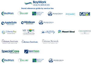
A House of Brands

Deliverable
A New Position-Based Identity

The logo mark represents a pathway of recovery for patients – which is not always straight. The identity acknowledges that it takes a combination of the power of evidence-based programs and a spirit of harmony and renewal from the caregivers to achieve success. The result is a bright and optimistic future at the end of the journey.
Deliverable
An Endorsed Brand Strategy to Unify and Align all Brands Under the BayMark Umbrella

To learn more about Springboard’s identity and brand architecture expertise and understand how we help build brands from the inside through internal communications, please contact us now.

