A logo redesign is one of the most rewarding projects to be involved in. There is a real sense of responsibility to the brand and a lot of pressure to get it right. Not only does a new healthcare brand identity need to be authentic, it also needs to be able to stand the test of time. A logo is so much more than just a design, it is the most “visible value” of the service or product. It gives a face to a name and can help tell a story. As the visual identity of a brand, a logo also helps the customer remember their experience with a company.
Although most of us in the ad agency or healthcare marketing worlds are not designers by trade, many of us are quick to have an opinion when presented with logo concepts. And while we often base our critique of a logo on the subjective, David Airey suggests otherwise in his book Logo Design Love. In it he shares insights on the history and evolution of iconic designs, such as FedEx, Citi and Kellogg’s. His knowledge of branding and years of experience designing logos led him to define the “seven elements of iconic design”. Here is a quick overview:
Keep it simple . . .
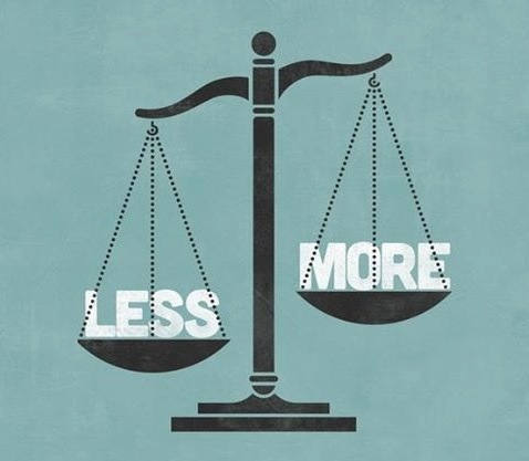
A simple logo means it is a versatile one, so it will work in a variety of media applications, such as signage, digital advertising and collateral.
Make it relevant . . .
The logo must be relevant to the industry, the client (stakeholders) and the customer. The logo doesn’t need to literally say what the company does, but it does need to help tell the company’s story and make it stand out from its competitors.
Incorporate tradition . . .
Consider using symbols that have been long associated with the brand. Airey mentions how Vanderbilt University’s logo design incorporates the oak leaf (strength and steadfastness) and the acorn (seed of knowledge), elements that not only represent the school’s values, but also reflect its status as an active arboretum.
Aim for distinction . . .
An iconic logo needs to stand out and be something consumers won’t forget. People are inundated with messages everywhere they turn (over 5,000 a day!), so the logo should be easily recognizable and centered on a strong idea. Airey recommends designing a logo in black and white first to test its strength. Colors are secondary to the idea or shape of the design.
Commit to memory . . .
As Airey points out, sometimes one quick glance is all the time you have to make an impression on your audience. Imagine consumers driving past your billboard. Again, keep it simple.
Think small . . .
Logos need to be adaptable for a variety of applications, including very small spaces such as banner ads or social media icons. According to Airey, the minimum size of your logo should be one inch without the loss of detail.
Focus on one thing . . .
Focus on one feature or idea in your design, not two or three. Don’t overdo it with so much cleverness that it becomes confusing and easily dismissed.
An iconic logo design is able to stand out from the thousands of other logos consumers are bombarded with on a daily basis. An iconic design is simple, relevant, distinctive and timeless. Does your brand’s logo have what it takes to be an iconic design? If not, it might be time to consider updating.
Click here to learn more about Springboard and how to update your healthcare brand identity.

